My order of operations for investigating an alarming chart
Someone on the Marketing team pulls up a chart: Conversion rate from free trial to paying customer is lower than it used to be. But why?
Think small, and think short-term. In my experience, most people do the opposite. They tend to reach first for macro explanations rather than micro ones. And many are tempted to point to long-running trends, rather than discrete changes.
Thinking small, and thinking short term, is based on two core tenets:
Most clear effects have a discrete, almost mechanical cause
Most clear causes are under your control
With those beliefs in mind, here’s the order of operations I use to investigate potential causes of weird trends.
Most likely explanations: Smoking guns
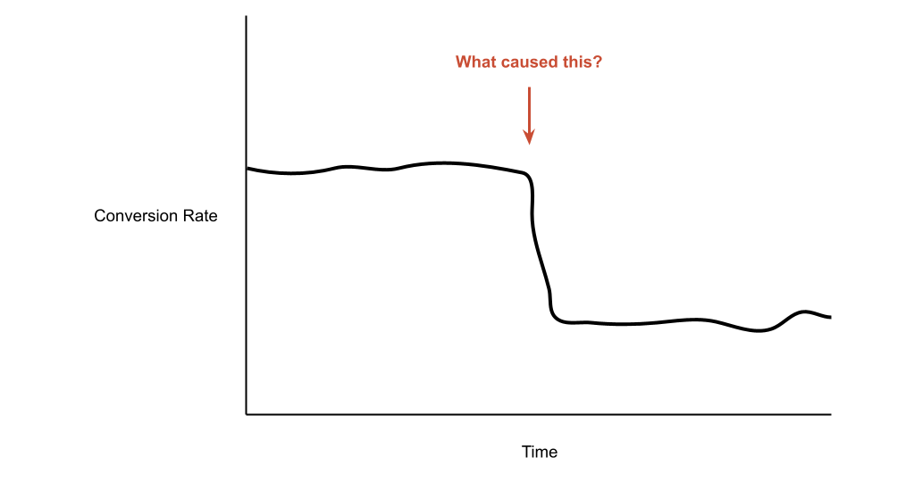
These are the proposed causes that happen at the same time we see a discrete effect. Imagine a conversion rate chart that looks like this:
1. Measurement issues
Is the data itself is wrong because we changed how we logged or collected it? Maybe we renamed a property, or stopped logging a critical event, or accidentally froze a system.
2. Discrete marketing change
Did we change how we sourced customers in an immediate, measurable way? This would include turning on or off entire marketing channels, launching a big email blast,
3. Discrete product change
Did we ship a new feature that could affect user behavior? This would include everything from a new onboarding flow to new pricing to entirely new functionality.
Plausible explanations: Correlated trends
These tend to be less obvious situations, where “somethings’s changed” but it takes a while for the change to play out. You usually end up looking at other medium-term trends and trying to line them up. You often don’t find a good explanation.

4. Measurable change in product usage
This is different from being able to point to a specific change. Instead, you’re looking for a correlated trend, which in turn may point you to a specific cause. For instance, if more and more users are logging into your product on mobile instead of desktop, that might explain a corresponding change in the types of features being used. A specific change may have kicked off the trend, but it won’t be the same kind of instantaneous, smoking gun relationship of the earlier explanations.
5. Measurable change in related marketing trend
Less likely explanations: More distant changes
Here’s where things get less plausible. For these macro explanations to hold true, you’re looking for effects that are shared broadly across your customer base and that tend to phase in at a very similar time,

6. Macro conditions (eg recession)
What would you expect to see if a recession was slowing your business? You’d expect all of your customers to slow down too, or at least those in similar segments. You’d expect the effect to arrive somewhat slowly (unless we’re talking Covid, a rare macro explanation that caused immediately identifiable effects).
7. Competitor behavior
Most businesses don’t have customers that are regularly comparing between their product and their competitors’. As a result, competitor effects almost never show up in your own product. There are exceptions, though: Instagram Stories’ impact on Snapchat, for instance.
Least likely explanations: Hand-wavy trends
8. Vague trends
I hear something like this a lot: “Well, it makes sense that our conversion rate is falling because we’re bigger now, so prospects are less qualified.” Usually this is stated without evidence. Unless this statement can be converted into one of the above — most likely, charts of changes in key marketing or product usage trends — it’s usually bunk.
Here’s what this looks like if you zoom way out: